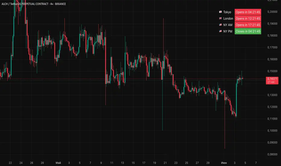
Session Status Table📌 Session Status Table
Session Status Table is an indicator that displays the real-time status of the four major trading sessions:
* 🇯🇵 Asia (Tokyo)
* 🇬🇧 London
* 🇺🇸 New York AM
* 🇺🇸 New York PM
It shows which sessions are currently open, how much time remains until they open or close, and optionally sends alerts in advance.
🧩 Features:
* Real-time session table — shows the status of each session on the chart.
* Color-coded statuses:
* 🟢 Green – Session is open
* 🔴 Red – Session is closed
* ⚪ Gray – Weekend
* Countdown timers until session open or close.
* User alerts — receive a notification a custom number of minutes before a session starts.
⚙️ Customization:
* Table position — fully configurable.
* Session colors — customizable for open, closed, and weekend states.
* Session labels — customizable with icons.
* Notifications:
* Enabled through TradingView's Alerts panel.
* User-defined lead time before session opens.
🕒 Time Zones:
All times are calculated in UTC to ensure consistency across different markets and regions, avoiding discrepancies from time zones and daylight saving time.
🚨 How to enable alerts:
1. Open the "Alerts" panel in TradingView.
2. Click "Create Alert".
3. In the condition dropdown, choose "Session Status Table".
4. Set to any alert() trigger.
5. Save — you'll be notified a set number of minutes before each session begins.
ℹ️ Technical Notes:
* Built with Pine Script version 6.
* Logically divided into clear sections: inputs, session calculations, table rendering, and alerts.
* Optimized for performance and reliability on all timeframes.
Ideal for traders who use session activity in their strategies — especially in Forex, crypto, and futures markets.
Pesquisar nos scripts por " TABLE "
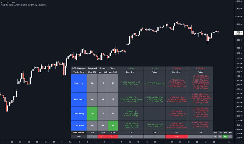
GOD Complex Analysis Table By QTX Algo SystemsGOD Complex Analysis Table by QTX Algo Systems
Overview
The GOD Complex Analysis Table is a powerful visual companion for traders using the GOD Complex ecosystem. It displays detailed confluence scores for each trade type (Reversal Long, Reversal Short, Continuation Long, Continuation Short), offering a breakdown of required vs. extra signals, as well as multi-timeframe (MTF) scores and bias.
This tool is designed to help discretionary traders better understand how multiple conditions across timeframes align to support high-quality trade setups. It is not a standalone signal generator but rather an advanced diagnostic table that reveals the logic driving the GOD Complex entries.
How It Works
Each row in the table represents a trade type (e.g., Reversal Long), and includes:
Required Score – Based on must-have conditions for that trade type (e.g., oversold levels, statistical extremes, key momentum shifts).
Extra Score – Bonus confluence points from higher timeframe agreement, slope shifts, or secondary confirmation indicators.
Total Score – Combined Required + Extra score (max 200), useful for comparing relative strength across trade types.
Breakdown Columns – Show exactly which conditions are currently satisfied or missing, categorized as Required or Extra.
MTF Scores – Score-based analysis across 5m to 1M timeframes, highlighting how confluence changes with zoomed-out perspectives.
MTF Bias Row – Net bullish vs. bearish confluence per timeframe (positive = green, negative = red).
Indicators Used (All Proprietary QTX Tools)
VBM (Volatility-Based Momentum): Confirms directional trend and volatility environment.
VBSMI (Volatility-Based SMI): Adapts momentum oscillator based on market conditions and tilt logic.
SEA (Statistically Extreme Areas): Identifies when price reaches statistically rare volatility/range zones.
SPB (Statistical Price Bands): Tracks dynamically adjusted support/resistance based on percentile deviation.
COI (Continuation Opportunity Indicator): Detects pullback exhaustion and momentum re-acceleration opportunities.
Each trade type (Reversal or Continuation) is scored based on these tools across local and higher timeframes.
Key Table Features
🔍 Reversal Scoring Logic
Reversal trades must meet key oversold/overbought criteria (e.g., VBSMI extremes, SEA/SPB triggers) and be supported by trend weakness or exhaustion in the COI/VBM logic. High confluence across timeframes boosts the score.
📈 Continuation Scoring Logic
Continuations require strong trend alignment (VBM, COI), confirmation of momentum (VBSMI cross + slope), and lack of statistical extremes (no SEA/SPB hits). HTF agreement increases the score further.
🧠 Multi-Timeframe (MTF) Scoring
MTF scores are generated by evaluating each trade type’s core confluence across timeframes (e.g., 5m, 1H, 1D, etc.). This helps traders gauge how well a setup aligns with the broader market structure.
📊 Bias Coloring
The MTF Bias row shows net directional strength. Green = bullish bias. Red = bearish bias. Gray = neutral.
🔎 Factors Breakdown
View factors for each trade type. These factors explain which required and extra conditions are currently contributing or missing.
Customization Options
Table position (top/bottom, left/right)
Table size (small, medium, large)
Show/hide trade type rows
Enable/disable breakdown details
Toggle MTF Score section
Use Cases
Analyze high-confluence setups for discretionary trade planning
Cross-check live trades to understand setup quality
Confirm MTF alignment before entries
Study historical patterns to build intuition and strategy
Disclaimer
This indicator is for educational purposes only. It does not provide financial advice or trade recommendations. Always backtest and validate strategies before use.
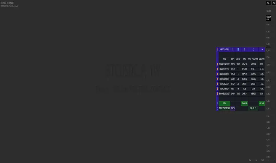
PORTFOLIO TABLE Full [Titans_Invest]PORTFOLIO TABLE Full
This is a complete table for monitoring your assets or cryptocurrencies in your SPOT wallet without needing to access your broker’s website or app.
⯁ HOW TO USE THIS TABLE❓
Simply select the asset and enter the amount you hold.
The table will display the value of each asset and the total value of your portfolio.
You can monitor up to 19 assets in real time.
⯁ CONVERT VALUES
You can also enable and select a currency for conversion.
For example, cryptocurrencies are calculated in US dollars by default, but you can choose euros as the conversion currency.
The values originally in dollars will then be displayed in euros.
⯁ TRACK THE DAILY VARIATION OF YOUR PORTFOLIO
You’ll be able to monitor your portfolio’s raw daily variation in real time.
🔶 Track your Portfolio in real time:
🔶 Add your local Currency to Convert Values:
🔶 Follow your Portfolio Live:
___________________________________________________________
📜 SCRIPT : PORTFOLIO TABLE Full
🎴 Art by : @Titans_Invest & @DiFlip
👨💻 Dev by : @Titans_Invest & @DiFlip
🎑 Titans Invest — The Wizards Without Gloves 🧤
✨ Enjoy!
___________________________________________________________
o Mission 🗺
• Inspire Traders to manifest Magic in the Market.
o Vision 𐓏
• To elevate collective Energy 𐓷𐓏
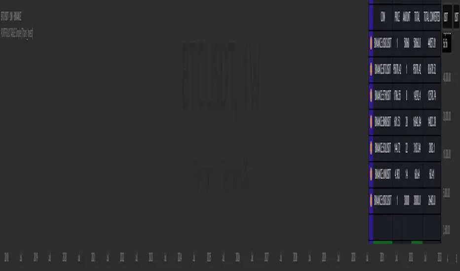
PORTFOLIO TABLE Simple [Titans_Invest]PORTFOLIO TABLE Simple
This is a simple table for you to monitor your assets or cryptocurrencies in your SPOT wallet without needing to access your broker’s website or wallet app.
⯁ HOW TO USE THIS TABLE❓
You only need to select the asset and enter the amount of each one.
The table will show how much you have of each asset and the total value of your portfolio.
You’ll be able to monitor up to 39 assets in real time.
⯁ CONVERT VALUES
You can also activate and select a currency for conversion.
For example, cryptocurrency assets are calculated in US dollars, but you can select euros as the conversion currency.
The values originally in dollars will then be displayed in euros.
⯁ Track your Portfolio in real time:
⯁ Add your local Currency to Convert Values:
⯁ Follow your Portfolio Live:
___________________________________________________________
📜 SCRIPT : PORTFOLIO TABLE Simple
🎴 Art by : @Titans_Invest & @DiFlip
👨💻 Dev by : @Titans_Invest & @DiFlip
🎑 Titans Invest — The Wizards Without Gloves 🧤
✨ Enjoy!
___________________________________________________________
o Mission 🗺
• Inspire Traders to manifest Magic in the Market.
o Vision 𐓏
• To elevate collective Energy 𐓷𐓏
6 Moving Averages Difference TableIndicator Summary: 6 Moving Averages Difference Table (6MADIFF)
This TradingView indicator calculates and plots up to six distinct moving averages (MAs) directly on the price chart. Users have extensive control over each MA, allowing selection of:
Type: SMA, EMA, WMA, VWMA, HMA, RMA
Length: Any positive integer
Color: User-defined
Visibility: Can be toggled on/off
A core feature is the on-chart data table, designed to provide a quick overview of the relationships between the MAs and the price. This table displays:
$-MA Column: The absolute difference between the user-selected Input Source (e.g., Close, Open, HLC3) and the current value of each MA.
MA$ Column: The actual calculated price value of each MA for the current bar.
MA vs. MA Matrix: A grid showing the absolute difference between every possible pair of the calculated MAs (e.g., MA1 vs. MA2, MA1 vs. MA3, MA2 vs. MA5, etc.).
Customization Options:
Input Source: Select the price source (Open, High, Low, Close, HL2, HLC3, OHLC4) used for all MA calculations and the price difference column.
Table Settings: Control the table's visibility, position on the chart, text size, decimal precision for displayed values, and the text used for the column headers ("$-MA" and "MA$").
Purpose:
This indicator is useful for traders who utilize multiple moving averages in their analysis. The table provides an immediate, quantitative snapshot of:
How far the current price is from each MA.
The exact value of each MA.
The spread or convergence between different MAs.
This helps in quickly assessing trend strength, potential support/resistance levels based on MA clusters, and the relative positioning of short-term versus long-term averages.

Funding Rate Signal TableDescription
Funding Rate Signal Table computes a rolling “funding rate” value (simulated here as (close–open)/close), smooths it, and presents both a compact on-chart table and clear LONG/SHORT entry signals. It helps you spot when funding dynamics may favor long or short positions and visualizes the last signal’s price level.
1. Why This Mashup?
Funding Rate Trend: A smoothed funding rate highlights shifts in trader funding costs—extremely negative rates can signal bullish opportunity, while very positive rates can warn of bearish pressure.
Difference Filter: Optional “difference” check prevents signals on noisy small changes, requiring a meaningful move before confirming.
Table & Labels: Side-by-side display of current funding rate, prior value, absolute change and text signal makes interpretation immediate. Simultaneous price-level lines reinforce real-time trade reference.
2. Default Parameters & Data Assumptions
Funding Calculation: (close – open) / close * 100, smoothed by a 14-period SMA plus 3-period SMA.
Thresholds:
LONG if funding_rate < –0.01%
SHORT if funding_rate > 0.01%
Optional “difference” threshold of 0.002 (0.2%)
Visuals:
Table positioned top-right with ticker, timeframe, funding values, difference, and signal.
Labels sized Normal by default, drawn just above/below price with optional price text.
Dashed horizontal lines extend 200 bars to mark last LONG/SHORT price.
Note: Because Pine Script cannot natively access actual exchange funding data, this example simulates funding rate. Replace the raw_funding_rate formula with your real funding-feed series for accurate signals.
3. How to Use
Add to Chart → Select “Rolin Long – Funding Rate & Sinyal Tablosu.”
Adjust Settings → Open the indicator’s Inputs:
Period & Smoothing for your instrument’s data frequency.
Thresholds based on historical funding ranges you observe.
Enable “Difference” filter to reduce false triggers.
Toggle Price Levels if you prefer lines marking entry prices.
Interpret Table →
“Funding Rate”: smoothed value for current bar.
“Previous Funding”: last bar’s value.
“Difference”: absolute change.
“Signal”: “LONG ▲ Şartları” or “SHORT ▼ Şartları” when thresholds are met.
Watch for Labels → On a new bar close, a singular LONG or SHORT label appears at the bar where the condition first became true.
Plan Entries/Exits → Use the price-level lines and your own risk rules to size and time trades.
4. Warnings & Disclaimer
This indicator is for educational purposes only. Simulated funding rate may differ from real exchange fees. Always verify with actual funding data, apply your own risk management, and adjust commissions/slippage to your trading environment. Past indicator signals do not guarantee future performance.

VWAP table with color
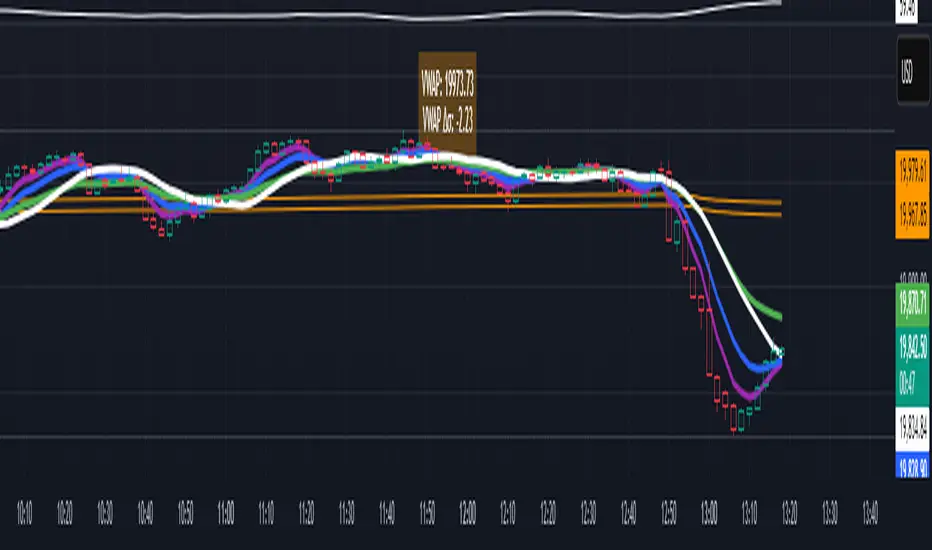
## 📊 VWAP Table with Color – Clear VWAP Deviation at a Glance
This script displays a **VWAP (Volume-Weighted Average Price)** table in a non-intrusive, color-coded panel on your chart. It helps you **quickly assess where the current price stands relative to VWAP**, classified into sigma bands (standard deviations). The goal is to provide valuable VWAP insight **without cluttering the chart with multiple lines**.
---
### 🔍 Purpose & Concept
VWAP is a powerful tool used by institutional traders to measure the average price an asset has traded at throughout the day, based on both volume and price.
In this script:
- We **do not plot traditional VWAP lines** with multiple ±1σ, ±2σ, etc., on the chart.
- Instead, we **summarize VWAP and its relative position in a table**, color-coded by deviation.
- This provides the **same information**, but in a **cleaner, minimal, and visually digestible format**.
---
### 🧠 VWAP Deviation Classification
The script calculates how far the current price is from the VWAP, in units of **standard deviation (σ)**.
The formula is:
```plaintext
VWAP Delta σ = (Current Price - VWAP) / Standard Deviation
```
This gives you a normalized value for deviation from VWAP, and it is **clamped between -3 and +3** to avoid extreme outliers.
Each range is color-coded and classified as:
| VWAP Δσ | Zone | Interpretation | Color |
|---------|---------------|------------------------------------------|--------------|
| -3σ | Far Below | Strongly below VWAP – potentially oversold | 🔴 Red |
| -2σ | Below | Below VWAP – bearish territory | 🟠 Orange |
| -1σ | Slightly Below| Slightly under VWAP – weak signal | 🟡 Yellow |
| 0σ | At VWAP | Price is around VWAP – neutral zone | ⚪ Gray |
| +1σ | Slightly Above| Slightly above VWAP – weak bullish | 🟢 Lime Green |
| +2σ | Above | Above VWAP – bullish signal | 🟢 Green |
| +3σ | Far Above | Strongly above VWAP – potentially overbought | 🟦 Teal |
This **compact summary in the table** provides a clear situational view while keeping the chart clean.
---
### ⚙️ User Customization
Users can configure:
- **VWAP σ Multiplier** (default 0.1) to set the width of the optional VWAP band on the chart.
- **Table Position** (Top Center, Bottom Right, etc.).
- **Text Size** and **Text Color**.
- **Hide VWAP logic**: VWAP data can be hidden automatically on higher timeframes (e.g., daily or weekly).
- **Enable/disable the VWAP ±σ band lines** (optional visual aid).
---
### 📐 Technical Highlights
- VWAP is recalculated each day using `ta.vwap(hlc3, isNewPeriod, 1)`.
- The band width uses standard deviation and the selected multiplier: `VWAP ± σ * multiplier`.
- Table updates dynamically with the new VWAP values each day.
- To **avoid floating-point rounding issues**, `vwapDelta` is rounded before comparison, ensuring correct background color display.
---
### ✅ Why Use This?
- Keeps your chart **visually clean and readable**.
- Gives **immediate context** to current price action relative to VWAP.
- Helps **discretionary traders** or **scalpers** decide whether price is stretched too far from the mean.
- Easier than tracking multiple σ bands manually.
---
### Example Usage:
- On intraday timeframes, you can identify price exhaustion as it hits ±2σ or ±3σ.
- On a 5-minute chart, if price touches `+3σ`, you may consider taking profits on longs.
- On reversal setups, watch for price at `-3σ` with bullish divergence.
---
### 🧩 Future Enhancements (Optional Ideas)
- Add alerts for when `vwapDelta` crosses thresholds like ±2σ or ±3σ.
- Let user select the timeframe for VWAP source (e.g., 1H, 5M, etc.).
- Extend to display VWAP on session or weekly basis.
---
Let me know if you want a version of this script formatted and cleaned up for direct TradingView publication (with annotations, credits, and formatting). Would you like that?
Trend Degree Dashboard (Table)📈 Trend Degree Dashboard (Table) — v1.0
This indicator calculates and displays the trend angle (in degrees) based on the linear regression of the selected source (default: close) over a user-defined lookback period (default: 21 bars).
The trend angle gives a quick visual reference of the current market slope — positive (uptrend) or negative (downtrend).
A dashboard table shows the trend angle directly on the chart, with a background color:
🟩 Green background for positive angles (uptrend)
🟥 Red background for negative angles (downtrend)
🔧 Features:
Customizable Lookback Period: Set the number of candles to consider for trend calculation.
Source Selection: Apply the analysis to close, open, high, low, or any other price series.
Dashboard Positioning: Choose where the dashboard appears (Top Left, Top Right, Bottom Left, Bottom Right).
Clean Table Design: Minimalistic and easy-to-read dashboard with automatic background color highlighting based on trend direction.
⚙️ How It Works:
It uses Linear Regression to measure the slope between two consecutive points.
Converts the slope into degrees using the arctangent function (atan) for a geometric interpretation of trend strength and direction.
Updates the dashboard table live with the latest angle value.
✅ Script Highlights:
Non-repainting: Once a bar closes, its value is fixed.
Efficient performance: Lightweight table visualization with no heavy calculations.
Clear trading signals: Positive angles suggest bullish momentum, negative angles suggest bearish momentum.
⚠️ Disclaimer:
This script is a technical analysis tool designed to assist in decision-making but does not guarantee results.
Please use it alongside other tools and practice proper risk management. Always test any indicator on demo accounts before applying it to live trading.

Lot Size TableLot Size Table Indicator – Pine Script (v5)
This TradingView script, “Lot Size Table,” creates a dynamic on-chart table that helps forex traders quickly calculate position sizes (lot sizes) for different capital and risk settings across various stop-loss (SL) pip scenarios.
🔧 Key Features:
📊 Real-time Forex Price Integration
Retrieves daily forex prices from OANDA for accurate lot size adjustments.
Instruments supported: USDJPY, USDCHF, AUDUSD, GBPUSD, NZDUSD, USDCAD, EURUSD.
🧠 Smart Lot Size Adjustments
Custom function adjustLotSize() adjusts lot sizes based on:
The currency of the instrument (e.g., JPY, GBP, AUD, etc.).
Special multiplier for symbols like US30 (e.g., ×8.5).
🧾 Flexible Capital & Risk Inputs
Supports 3 customizable capital groups, each with its own:
Capital amount
Risk percentage
📉 Multiple Stop-Loss (SL) Scenarios
Users input a comma-separated list of SL pip values (e.g., "20,25,30,...").
For each SL value, lot sizes are calculated for all 3 capital/risk combinations.
📋 Formatted On-Chart Table
Displays in a user-selected corner of the chart.
Customizable size, background color, and border.
Header row includes capital values and risk % (formatted to "k" if over 1,000).
Remaining rows show calculated lot sizes for each SL pip value.
📐 How It Works:
User Inputs: Capital, risk %, SL pip list, and table styling.
Calculation:
Lot size = (capital × risk%) / (SL pips × 10)
Adjusted based on instrument’s currency.
Display:
Table shows all SL pip scenarios and the corresponding adjusted lot sizes for each capital group.

Multi-Symbol EMA Status Table🔍 Multi-Symbol EMA Trend Scanner Table
This script displays a clean, customizable table showing whether the price of up to 16 different assets is above or below a user-defined EMA, on a per-symbol and per-timeframe basis.
✅ Supports up to 16 symbols, each with:
Custom exchange + ticker (e.g., BINANCE:BTCUSDT.P, PEPPERSTONE:EURUSD)
Custom timeframe (e.g., 15, 60, 240, D, W)
Custom EMA length (e.g., 50, 100, 200)
🧩 Fully customizable visuals:
Table position (top, middle, bottom + left, center, right)
Text size and text color
Background color for "above" and "below" EMA
Optional ✅❌ emojis
📊 The table updates live on your main chart — no switching required!
💡 Great for:
Monitoring trend direction across multiple markets
Spotting trend alignment (e.g., price above 200 EMA on 4H + 1D)
Multi-asset swing trading or scalping strategies
📘 How to Use:
Open a chart and add the indicator from your scripts.
In the settings panel:
Enter any symbol (with exchange prefix, like BINANCE:BTCUSDT.P or OANDA:EURUSD)
Set a timeframe (e.g., "15" for 15min, "60" for 1h, "D" for daily)
Choose your EMA length (e.g., 200)
Repeat for as many symbols as you need (up to 16).
Customize table visuals:
Position on the screen
Font size and color
Enable/disable emojis ✅❌
Watch the table update live!
🧠 Optional Tips:
Use different colors or groupings to track asset classes (crypto, forex, stocks).
Combine it with your favorite entry/exit signals for confirmation.
Try setting all symbols to the same EMA (e.g., 200) but with different timeframes to monitor multi-timeframe alignment.

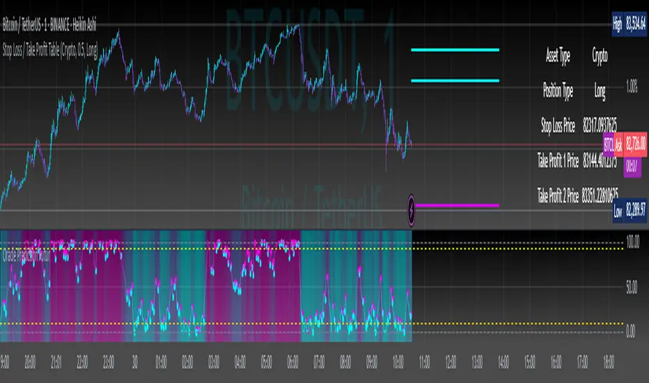
Stop Loss / Take Profit Table// (\_/)
// ( •.•)
// (")_(")
📈 Introducing the Stop Loss / Take Profit Table Indicator! 📈
Enhance your trading strategy with our powerful Stop Loss / Take Profit Table indicator, designed for traders in the Crypto, Stock, and Forex markets. This easy-to-use tool helps you manage risk and maximize profits by clearly displaying your Stop Loss and Take Profit levels based on your trading position.
Key Features:
Custom Asset Types: Choose between Crypto, Stock, or Forex to tailor the indicator to your specific trading style.
Dynamic Stop Loss & Take Profit Calculation: Set your desired Stop Loss percentage, and the indicator will automatically calculate your Stop Loss and two Take Profit levels based on different timeframes (1 min to 240 min).
Position Type Flexibility: Whether you're trading Long or Short, the indicator adjusts the calculations accordingly, providing you with precise price levels for effective risk management.
Visual Representation: Stop Loss and Take Profit levels are marked directly on the chart with distinctive horizontal lines in vibrant colors for easy reference.
Informative Table Display: A dedicated table displayed on the chart shows your asset type, position type, and calculated prices for Stop Loss and Take Profit levels, ensuring you have all critical data at a glance.
Alert Notifications: Stay informed with optional alerts that signal when your Stop Loss or Take Profit levels are hit, allowing you to react swiftly in fast-moving markets.
Why Use This Indicator?
Managing your trades is critical for success in the financial markets. With our Stop Loss / Take Profit Table, you can easily set your parameters and visually track your risk and reward levels, making it a practical addition to any trader's toolkit.
Get started today and take control of your trading strategy! ✨
Happy trading! 📊🚀
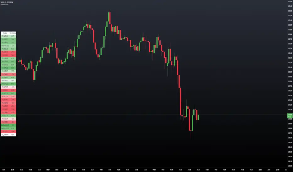
Correlation TableThis indicator displays a vertical table that shows the correlation between the asset currently loaded on the chart and up to 32 selected trading pairs. It offers the following features:
Chart-Based Correlation: Correlations are calculated based on the asset you have loaded in your chart, providing relevant insights for your current market focus.
Configurable Pairs: Choose from a list of 32 symbols (e.g., AUDUSD, EURUSD, GBPUSD, etc.) with individual checkboxes to include or exclude each pair in the correlation analysis.
Custom Correlation Length: Adjust the lookback period for the correlation calculation to suit your analysis needs.
Optional EMA Smoothing: Enable an Exponential Moving Average (EMA) on the price data, with a configurable EMA length, to smooth the series before calculating correlations.
Color-Coded Output: The table cells change color based on the correlation strength and direction—neutral, bullish (green), or bearish (red)—making it easy to interpret at a glance.
Clear Table Layout: The indicator outputs a neatly organized vertical table with headers for "Pair" and "Correlation," ensuring the information is displayed cleanly and is easy to understand.
Ideal for traders who want a quick visual overview of how different instruments correlate with their current asset, this tool supports informed multi-asset analysis
ITALIANO:
Questo indicatore visualizza una tabella verticale che mostra la correlazione tra l'asset attualmente caricato sul grafico e fino a 32 coppie di trading selezionate. Offre le seguenti funzionalità:
Correlazione basata sul grafico: le correlazioni vengono calcolate in base all'asset caricato nel grafico, fornendo informazioni pertinenti per il tuo attuale focus di mercato.
Coppie configurabili: scegli da un elenco di 32 simboli (ad esempio, AUDUSD, EURUSD, GBPUSD, ecc.) con caselle di controllo individuali per includere o escludere ciascuna coppia nell'analisi della correlazione.
Lunghezza di correlazione personalizzata: regola il periodo di lookback per il calcolo della correlazione in base alle tue esigenze di analisi.
Smoothing EMA opzionale: abilita una media mobile esponenziale (EMA) sui dati dei prezzi, con una lunghezza EMA configurabile, per smussare la serie prima di calcolare le correlazioni.
Output codificato a colori: le celle della tabella cambiano colore in base alla forza e alla direzione della correlazione, neutra, rialzista (verde) o ribassista (rosso), rendendola facile da interpretare a colpo d'occhio.
Clear Table Layout: l'indicatore genera una tabella verticale ordinatamente organizzata con intestazioni per "Coppia" e "Correlazione", assicurando che le informazioni siano visualizzate in modo chiaro e siano facili da comprendere.
Ideale per i trader che desiderano una rapida panoramica visiva di come diversi strumenti siano correlati con il loro asset corrente, questo strumento supporta un'analisi multi-asset informata
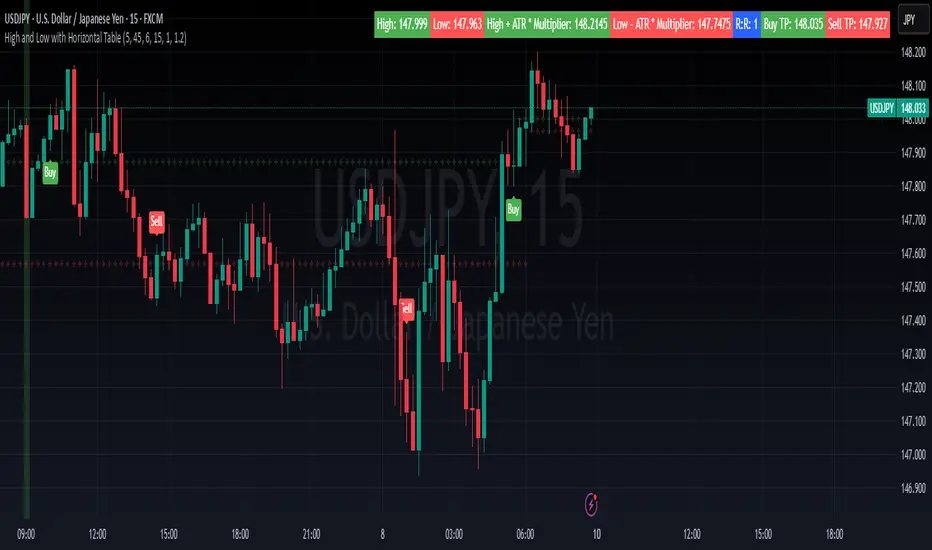
High and Low with Horizontal TableHigh and Low with Horizontal Table Indicator
Overview
The "High and Low with Horizontal Table" indicator is designed for traders who wish to monitor key levels based on specific candle times, along with dynamic risk-to-reward ratios and ATR-based values. This indicator features real-time calculations, visual cues, and a table for quick reference of the calculated values.
Key Features
Custom Time Inputs:
Users can define two specific time inputs to select the candles for the High and Low prices. These times can target the same or separate candles.
ATR-based Calculation:
The indicator allows users to apply an ATR Multiplier to adjust the calculation of key levels. By default, the ATR multiplier is set to 1.2, but users can adjust it to their preferred value (e.g., 1.5 or 2).
Risk-to-Reward (R:R) Calculation:
The Risk-to-Reward Ratio (R:R) is used to calculate potential Take Profit (TP) levels based on the high and low of the selected candle(s).
The default R:R ratio is 2.0, but it can be customized to suit the trader’s strategy.
Visual Markings:
The High and Low values are plotted with subtle markers on the chart (cross style) for easy identification. The display of these markers is subdued for minimal visual distraction.
Horizontal Table Display:
A horizontal table is generated in the top-right corner of the chart, providing a quick reference for the following values:
High and Low of the selected candle(s)
High + ATR Multiplier and Low - ATR Multiplier
R:R ratio
Buy TP and Sell TP levels
Each value is displayed with a reasonable number of decimal places (4 decimals) for major forex pairs, XAUUSD, and BTCUSD.
Input Parameters
Hour and Minute for High Candle: Select the time for the candle that will determine the High.
Hour and Minute for Low Candle: Select the time for the candle that will determine the Low.
ATR Multiplier: A customizable input for adjusting the ATR-based calculations (default is 1.2).
Risk-to-Reward (R:R): Set the ratio to determine the TP levels (default is 2.0).
How It Works
The user defines two distinct time inputs (one for the High and one for the Low).
At the specified times, the indicator captures the High and Low prices of the candles.
The ATR is calculated and adjusted by the user-defined ATR Multiplier to determine buffers above the High and below the Low.
The Risk-to-Reward ratio is applied to calculate the Take Profit levels.
All of these values are displayed on the chart and updated in real time. The horizontal table ensures quick reference to all the key levels without cluttering the main chart.
Use Cases
Trend Trading: Identify potential support and resistance levels based on specific timeframes and adjust TP targets using ATR.
Scalping: Use the ATR and R:R calculations to target precise entry and exit points.
Market Opens: Track key market opens (such as New York and London) with candle times that reflect your trading strategy.
Conclusion
The High and Low with Horizontal Table indicator is a powerful tool for traders looking to combine precise candle-based level tracking with ATR-based risk management. By displaying key levels and TP targets in a clear, tabular format, traders can quickly assess and act on key price levels throughout their trading sessions.
Price Alert Indicator with TableIndicator Description: Price Alert Indicator with Table
The Custom Price Alert Indicator with Table is a TradingView script designed to help traders monitor and react to significant price levels during the Asian and London trading sessions. This indicator provides visual alerts and displays relevant session data in a user-friendly table format.
Key Features:
User-Defined Session Times:
Users can specify the start and end hours for both the Asian (default: 8 AM to 2 PM) and London (default: 2 PM to 8 PM) trading sessions in their local time zone.
This flexibility allows traders from different regions to customize the indicator according to their trading hours.
Real-Time Highs and Lows:
The indicator calculates and tracks the high and low prices for the Asian and London sessions in real-time.
It continuously updates these values as new price data comes in.
Touch Notification Logic:
Alerts are triggered when the price touches the session high or low points.
Notifications are designed to avoid repetition; if the London session touches the Asian high or low, subsequent touches are not alerted until the next trading day.
Interactive Table Display:
A table is presented in the bottom right corner of the chart, showing:
The Asian low and high prices
The London low and high prices
Whether each price level has been touched.
Touched levels are visually highlighted in green, making it easy for traders to identify relevant price actions.
Daily Reset of Notifications:
The notification statuses are reset at the end of the London session each day, preparing for the next day’s trading activity.
Use Cases:
Traders can utilize this indicator to stay informed about pivotal price levels during important trading sessions, aiding in decision-making and strategy development.
The clear visual representation of price levels and touch statuses helps traders quickly assess market conditions.
This indicator is particularly beneficial for day traders and those who focus on price movements around key high and low points during the trading day.

Correction Table# Correction Table Indicator
A powerful TradingView indicator that displays a comprehensive table showing price corrections from All-Time High (ATH) and the 200-day Simple Moving Average (SMA).
## Features
- Real-time calculation of 200-day Simple Moving Average (SMA)
- Display of current price deviations from 200 SMA
- ATH-based correction levels (-10%, -20%, -30%, -40%, -50%)
- Clear visualization through a customizable table
- Price differences shown in both absolute and percentage terms
- Color-coded positive/negative deviations for better readability
## Parameters
- **ATH Calculation Period**: Number of days to look back for calculating All-Time High (default: 90 days)
## Table Information
The indicator displays a table in the top-right corner of your chart with the following information:
- **200 SMA**: Current 200-day Simple Moving Average value
- **ATH-10%**: Price level at 10% below All-Time High
- **ATH-20%**: Price level at 20% below All-Time High
- **ATH-30%**: Price level at 30% below All-Time High
- **ATH-40%**: Price level at 40% below All-Time High
- **ATH-50%**: Price level at 50% below All-Time High
Each row shows:
- Target price level
- Current deviation from the price
- Percentage deviation

VMA [Extreme Advanced Custom Table for BTCUSD]This indicator implements a Variable Moving Average (VMA) with a 33-period length—selected in homage to the Tesla 369 concept—to dynamically adjust to market conditions. It not only calculates the adaptive VMA but also displays a custom table of key metrics directly on the chart. Here’s how to use it:
Apply to Your Chart:
Add the indicator to your chart (optimized for BTCUSD, though it can be used on other symbols) and choose your desired source (e.g., close).
Customize Your Visuals:
Trend & Price Lines: Toggle the trend colors, price line, and bar coloring based on the VMA’s direction.
Channels & Slope: Enable the volatility channel and slope line to visualize market volatility and the VMA’s momentum.
Pivot Points & Super VMA: Activate pivot high/low markers for potential reversal points and a Super VMA (SMA of VMA) for an extra smoothing layer.
Table Customization: Adjust the table’s position, colors, and font sizes as needed for your viewing preference.
Monitor Key Metrics:
The dynamic table displays essential information:
VMA Value & Trend: See the current VMA and whether the trend is Bullish, Bearish, or Neutral.
Volatility Index (vI) & Slope: Quickly assess market volatility and the VMA’s slope (both absolute and percentage).
Price-VMA Difference & Correlation: Evaluate how far the price is from the VMA and its correlation.
Higher Timeframe VMA: Compare the current VMA with its higher timeframe counterpart (set via the “Higher Timeframe” input).
Alerts for Key Conditions:
Built-in alert conditions notify you when:
The trend changes (bullish/bearish).
The VMA slope becomes extreme.
The price and VMA correlation falls below a defined threshold.
The VMA crosses its higher timeframe average.
How to Use the Script:
Add to Your Chart:
Open TradingView and apply the indicator to your BTCUSD (or any other) chart.
The indicator will overlay on your chart, plotting the VMA along with optional elements such as the price line, volatility channels, and higher timeframe VMA.
Customize Your Settings:
Inputs:
Choose your data source (e.g., close price).
Adjust the VMA length (default is 33) if desired.
Visual Options:
Toggle trend colors, bar coloring, and additional visuals (price line, volatility channels, slope line, pivot points, and Super VMA) to suit your trading style.
Table Customization:
Set the table position, colors, border width, and font size to ensure key metrics are easily visible.
Higher Timeframe:
You can change the higher timeframe input (default is Daily) to better fit your analysis routine.
Interpret the Indicator:
Trend Analysis:
Watch the color-coded VMA line. A rising (orange) VMA suggests bullish momentum, while a falling (red) one indicates bearish conditions.
What Sets This Script Apart:
Dynamic Adaptation:
Unlike a fixed-period moving average, the VMA adjusts its sensitivity in real time by integrating a volatility measure, making it more adaptive to market swings.
Multi-Layered Analysis:
With integrated volatility channels, pivot points, slope analysis, and a higher timeframe VMA, this tool gives you a fuller picture of market dynamics.
Immediate Data at a Glance:
The real-time table consolidates multiple key metrics into one view, saving time and reducing the need for additional indicators.
Custom Alerts:
Pre-built alert conditions allow for timely notifications, ensuring you don’t miss critical market changes.

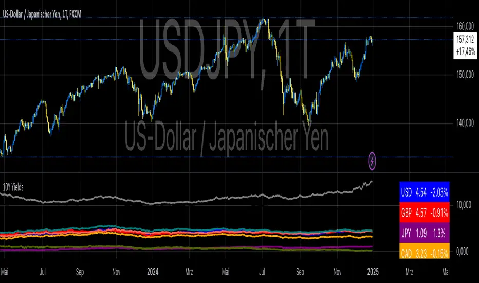
10-Year Yields Table for Major CurrenciesThe "10-Year Yields Table for Major Currencies" indicator provides a visual representation of the 10-year government bond yields for several major global economies, alongside their corresponding Rate of Change (ROC) values. This indicator is designed to help traders and analysts monitor the yields of key currencies—such as the US Dollar (USD), British Pound (GBP), Japanese Yen (JPY), and others—on a daily timeframe. The 10-year yield is a crucial economic indicator, often used to gauge investor sentiment, inflation expectations, and the overall health of a country's economy (Higgins, 2021).
Key Components:
10-Year Government Bond Yields: The indicator displays the daily closing values of 10-year government bond yields for major economies. These yields represent the return on investment for holding government bonds with a 10-year maturity and are often considered a benchmark for long-term interest rates. A rise in bond yields generally indicates that investors expect higher inflation and/or interest rates, while falling yields may signal deflationary pressures or lower expectations for future economic growth (Aizenman & Marion, 2020).
Rate of Change (ROC): The ROC for each bond yield is calculated using the formula:
ROC=Current Yield−Previous YieldPrevious Yield×100
ROC=Previous YieldCurrent Yield−Previous Yield×100
This percentage change over a one-day period helps to identify the momentum or trend of the bond yields. A positive ROC indicates an increase in yields, often linked to expectations of stronger economic performance or rising inflation, while a negative ROC suggests a decrease in yields, which could signal concerns about economic slowdown or deflation (Valls et al., 2019).
Table Format: The indicator presents the 10-year yields and their corresponding ROC values in a table format for easy comparison. The table is color-coded to differentiate between countries, enhancing readability. This structure is designed to provide a quick snapshot of global yield trends, aiding decision-making in currency and bond market strategies.
Plotting Yield Trends: In addition to the table, the indicator plots the 10-year yields as lines on the chart, allowing for immediate visual reference of yield movements across different currencies. The plotted lines provide a dynamic view of the yield curve, which is a vital tool for economic analysis and forecasting (Campbell et al., 2017).
Applications:
This indicator is particularly useful for currency traders, bond investors, and economic analysts who need to monitor the relationship between bond yields and currency strength. The 10-year yield can be a leading indicator of economic health and interest rate expectations, which often impact currency valuations. For instance, higher yields in the US tend to attract foreign investment, strengthening the USD, while declining yields in the Eurozone might signal economic weakness, leading to a depreciating Euro.
Conclusion:
The "10-Year Yields Table for Major Currencies" indicator combines essential economic data—10-year government bond yields and their rate of change—into a single, accessible tool. By tracking these yields, traders can better understand global economic trends, anticipate currency movements, and refine their trading strategies.
References:
Aizenman, J., & Marion, N. (2020). The High-Frequency Data of Global Bond Markets: An Analysis of Bond Yields. Journal of International Economics, 115, 26-45.
Campbell, J. Y., Lo, A. W., & MacKinlay, A. C. (2017). The Econometrics of Financial Markets. Princeton University Press.
Higgins, M. (2021). Macroeconomic Analysis: Bond Markets and Inflation. Harvard Business Review, 99(5), 45-60.
Valls, A., Ferreira, M., & Lopes, M. (2019). Understanding Yield Curves and Economic Indicators. Financial Markets Review, 32(4), 72-91.
Hourly Change Table (UTC Adjustable)### Indicator Description: Hourly Change Table (UTC Adjustable)
The **Hourly Change Table (UTC Adjustable)** is a powerful tool designed for analyzing **hourly average price changes** across financial instruments. By calculating and sorting these averages, the indicator identifies the hours with the most significant positive and negative price movements. It also provides visual highlights directly on the chart for easier decision-making.
---
### What Does This Indicator Do?
1. **Analyzes Hourly Average Price Changes**:
- It calculates the **average percentage price change** for each hour based on the selected lookback period.
2. **Displays a Ranked Table**:
- The indicator generates a table ranking hourly averages from the highest to the lowest, allowing you to see which hours are the most impactful.
3. **Highlights Max and Min Hours on the Chart**:
- The hour with the highest average price change is highlighted in **green**.
- The hour with the lowest average price change is highlighted in **red**.
4. **Adjusts for Time Zones**:
- A customizable **UTC Offset** ensures the indicator aligns with your preferred time zone.
---
### Key Features
1. **Customizable Lookback Period**:
- Define how many bars the indicator analyzes to calculate meaningful trends.
2. **Time Zone Adjustment**:
- Adjust the UTC offset to match your local trading hours or preferred analysis window.
3. **Graphical Chart Highlights**:
- Instantly identify the most significant hours with color-coded chart backgrounds.
4. **Sorted Data Table**:
- View a ranked list of hourly averages with the maximum and minimum values highlighted for quick reference.
---
### How to Use This Indicator?
1. **Add to Your Chart**:
- Apply the indicator to any financial instrument and time frame on TradingView.
2. **Set the Lookback Period**:
- Configure the "Lookback Bars" setting to define how many bars the indicator should analyze.
3. **Configure the UTC Offset**:
- Align the indicator with your preferred time zone by setting the appropriate UTC offset (e.g., `2` for UTC+2).
4. **Enable Background Highlighting (Optional)**:
- Turn on "Enable Background Highlighting" to visually highlight the max and min hours on the chart.
5. **Analyze the Table**:
- Use the table to identify consistent hourly trends and make informed trading decisions based on historical data.
---
### Practical Use Cases
- **Volatility Analysis**:
- Identify the hours of highest activity or price movement to create a more effective trading plan.
- **Market Timing**:
- Optimize entry and exit points by focusing on the hours with the highest or lowest average changes.
- **Custom Strategy Development**:
- Incorporate hourly averages into your trading strategies for greater precision.
---
### Example (BTC/USD)
1. You are analyzing the **BTC/USD pair** and set the **UTC Offset** to `2` (UTC+2) to match your local time zone.
2. The indicator calculates and identifies:
- **10:00-11:00 (UTC+2)** as the hour with the highest average price increase (e.g., +0.85%).
- **14:00-15:00 (UTC+2)** as the hour with the lowest average price change (e.g., -0.65%).
3. Based on this information:
- You decide to **closely monitor 10:00-11:00** for potential bullish activity or upward momentum.
- You prepare for **14:00-15:00** to act cautiously or position for potential bearish movements.
---
### Important Notes
- **This indicator does not provide financial or investment advice.**
- It is intended solely for **educational purposes** to assist traders in analyzing historical price data.
- Always consider additional market factors, perform your own research, and consult with a financial advisor before making trading or investment decisions.
---
This description emphasizes that the indicator calculates **hourly averages**, while also including a disclaimer clarifying its educational purpose. It’s suitable for publication on TradingView.

Volume TableDisplays a table of volume and short volume.
When chart timeframe is intraday or daily, table will show daily values. If chart is on weekly, table will show weekly values. If chart is on monthly, table will show monthly values.
If a ticker doesn’t have short volume, uncheck “Show Short Volume” in settings for table to work.
Table rows:
Date row (Day/Week/Month) text:
Green when close > open
Red when close < open
White when close equals open
Volume (Vol) row text:
Default: Black
If “Check for inside candles” is checked, when the high and low (or open and close if “Use H/L not O/C” is unchecked) is within the previous time period (day/week/month), text will be white
Volume (Vol) row background:
Default: Gray
Colored based on values and colors set in settings:
>= Very High Volume
>= High Volume
<= Low Volume
<= Very Low Volume
Short Volume (SV) row cell background color:
SV < “Lower Threshold”: Black
“Lower Threshold” <= SV < “Low Threshold”: Gray
“Low Threshold” < SV < First “Short Volume Color Increment”: Silver
“Short Volume Color Increment's (5 million increments by default): purple, blue, teal, green, lime, yellow, orange, red, maroon, white
Short Volume text color is just colored to be visible based on SV cell background.
There are labels that can be displayed to look back at data further back than the table goes (recommend being on the daily timeframe).

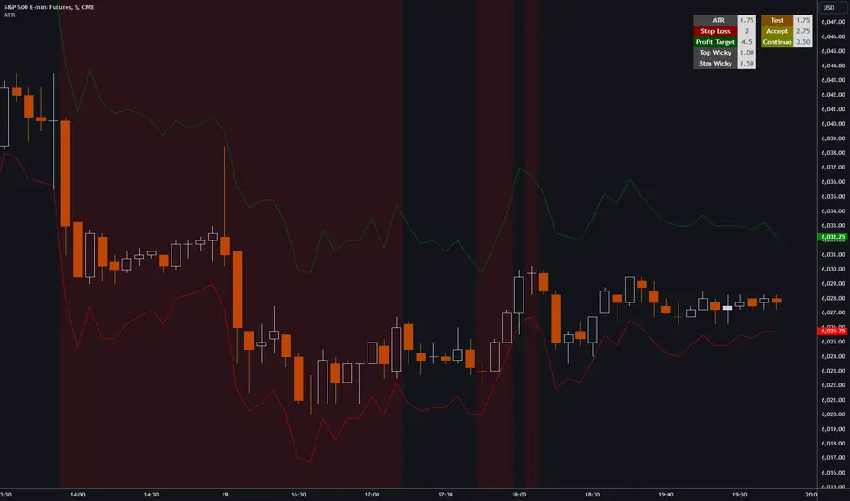
ATR, Chop, Profit Target and Stop Loss TableThe ATR Table indicator is a versatile tool that helps traders visually and quantitatively manage risk, identify market conditions, and set profit targets and stop-loss levels. It is designed to enhance decision-making by incorporating key volatility and chop (market consolidation) signals into a comprehensive table format.
Key Features:
Average True Range (ATR) Calculation : The indicator computes the ATR over a user-defined period (default 14). ATR helps to measure market volatility, providing insights into how much an asset's price typically moves within a given period.
Stop Loss and Profit Target Calculation : You can configure stop-loss and profit target levels using multipliers based on the ATR. This allows dynamic risk management that adjusts to market volatility:
Stop Loss : Defined as a multiple of the ATR to help control losses.
Profit Target : Also based on a multiple of the ATR to lock in gains. The user can specify whether they are trading long or short, and the indicator adjusts the levels accordingly.
Customizable Plot Lines : The indicator can display the Stop Loss and Profit Target levels directly on the chart. Users can toggle these lines on or off and customize their colors.
Chop Signa l: The indicator highlights potential consolidation periods (chop) using a wick-based analysis. It calculates the highest upper or lower wick values and compares them to the ATR to detect periods of indecision or consolidation.
Table Display : When these wick values exceed the ATR by a user-defined multiplier, the corresponding table rows are highlighted.
Background Alerts : Optionally, users can activate background color changes on the chart to visually alert them when chop conditions are detected.
Customizable Table Layout : A table displaying the key values (ATR, Stop Loss, Profit Target, Upper/Lower Wickiness) is placed on the chart. You can choose the table's position, adjust its color scheme, and decide which rows to display.
Chop Background Customization : For users who prefer more visual cues, the indicator allows you to enable or disable background shading when chop conditions are met. You can also choose the color of this background for better customization.
Risk Contract Table by Soothing TradesDescription:
Risk Contract Table by Soothing Trades
This script provides an intuitive table that displays the calculated risk in dollars for various contract sizes based on the size of the last closed candle.
It is designed to help traders quickly assess their risk exposure based on the most recent price movement.
Key Features:
Automatic and Manual Tick Value Calculation: Automatically fetches the tick value for your instrument.
You can also override it with a manual input using a convenient checkbox.
Customizable Contract Sizes: Easily input your preferred contract sizes.
The script dynamically adjusts the table headers and risk calculations based on your inputs.
Real-Time Updates:
The table updates with each new candle close, ensuring that your risk calculations are always based on the latest candle size.
User-Friendly Display: The table is displayed directly on your chart with customizable colors for both text and background, making it easy to match your chart’s theme.
How to Use:
Tick Value: By default, the script uses the automatic tick value.
To manually set the tick value, check the "Use Manual Tick Value" box and enter your desired value.
Contract Sizes: You can input the number of contracts for each category (5ct, 10ct, 15ct, 17ct). The script calculates and displays the risk for each contract size based on the tick movement of the last closed candle only.
Real-Time Calculations: Risk calculations are updated only after the candle is closed, so there are no misleading values during live market activity.
Customization Options:
Manual Tick Value Override: Use a custom tick value by enabling the "Use Manual Tick Value" option.
Custom Contract Sizes: Input your desired contract sizes, and the table headers and risk calculations will update accordingly.
Color Customization: Customize the text and background colors to fit your chart’s aesthetic.
How It Works:
The script calculates the tick movement from the last closed candle and multiplies it by the specified tick value and the number of contracts.
You can choose to use the default automatic tick value or manually input your own.
A table appears on the chart showing the risk for different contract sizes based solely on the size of the last candle, providing a quick snapshot of potential exposure from the most recent price movement.
This script is ideal for traders who want to keep a quick and accurate overview of their potential risk exposure based on the size of the most recent price action.
Whether you are scalping, day trading, or holding positions overnight, this tool by Soothing Trades will help you stay informed and make better trading decisions.
Happy Trading!
- use at own risk, for education and test purpose only.
Developed by Soothing Trades

Enhanced BOS Strategy with SL/TP and EMA TableDescription:
The Enhanced BOS (Break of Structure) Strategy is an advanced open-source trading indicator designed to identify key market structure changes, integrated with dynamic Stop Loss (SL) and Take Profit (TP) levels, along with an informative EMA (Exponential Moving Average) table for added trend analysis.
Key Features:
Break of Structure (BOS) Detection:
The script detects bullish and bearish BOS by identifying pivot points using a custom pivot period. When the price crosses above or below these points, it signals a potential market trend reversal or continuation.
Dynamic SL/TP Levels:
Users can toggle static SL/TP settings, which automatically calculate levels based on user-defined points. These levels are visualized on the chart with dotted lines and labeled for clarity.
Volume Filters:
The strategy includes a volume condition filter to ensure that only trades within a specified volume range are considered. This helps in avoiding low-volume trades that might lead to false signals.
EMA Table Display:
An on-chart table displaying the current values of the 13-period, 50-period, and 200-period EMAs. This provides a quick reference for trend identification and confirmation, helping traders to stay aligned with the broader market trend.
How It Works:
The script utilizes a combination of moving averages and pivot points to identify potential breakouts or breakdowns in market structure. When a bullish BOS is detected, and the volume conditions are met, the strategy suggests a long position, marking potential SL/TP levels. Similarly, it suggests short positions for bearish BOS.
The EMA table serves as a visual aid, providing real-time updates of the EMA values, allowing traders to gauge the market’s directional bias quickly.
How to Use:
Setting Parameters:
Adjust the pivot period to fine-tune BOS detection according to your trading style and the asset’s volatility.
Configure the SL/TP settings based on your risk tolerance and target profit levels.
Interpreting Signals:
A “Buy” label on the chart indicates a bullish BOS with volume confirmation, signaling a potential long entry.
A “Sell” label indicates a bearish BOS with volume confirmation, signaling a potential short entry.
The EMA table aids in confirming these signals, where the position of the fast, mid, and slow EMAs can provide additional context to the trend’s strength and direction.
Volume Filtering:
Ensure your trades are filtered through the script’s volume condition, which allows for the exclusion of low-volume periods that might generate unreliable signals.
Unique Value:
Unlike many other BOS strategies, this script integrates volume conditions and a visual EMA table, providing a comprehensive toolkit for traders looking to capture market structure shifts while maintaining an eye on trend direction and trade execution precision.
Additional Information:
This script is designed for use on standard bar or candlestick charts for best results.
It is open-source and free to use, encouraging collaboration and improvement by the TradingView community.
By combining powerful trend-following EMAs with the precision of BOS detection and the safety of volume filtering, the Enhanced BOS Strategy offers a balanced approach to trading market structure changes.

Current and Average Volume Table [CHE]Introduction:
The "Current and Average Volume Table " script is designed as a custom indicator for trading platforms that support Pine Script (specifically Pine Script version 5). This indicator provides a compact and informative table summarizing key volume-related metrics for financial instruments, enhancing traders' ability to analyze buying and selling dynamics over a specified period.
Description:
The script calculates and displays essential volume metrics in a customizable table format. It includes options for positioning the table on the chart (e.g., top-right, bottom-left) and adjusting its visual size (auto, huge, large, normal, small, tiny) to fit user preferences and chart layout.
Analysis:
The indicator computes several critical metrics:
Current Volume Metrics:
Current Volume: Displays the total volume traded in the current bar.
Buy Percentage (%): Indicates the proportion of the total volume attributed to buying activities.
Sell Percentage (%): Shows the percentage of the total volume attributed to selling activities.
Average Volume Metrics:
Average Volume: Calculates the simple moving average (SMA) of the volume over a specified number of bars. This provides a smoothed average volume figure, helping traders identify trends or anomalies in trading activity.
Average Buy Percentage (%): Computes the average percentage of buying volume over the SMA period.
Average Sell Percentage (%): Calculates the complementary percentage of selling volume over the SMA period.
The script uses conditional formatting to highlight cells based on comparative values of buy versus sell percentages and their averages. Green shades indicate higher buying activity, while red shades signify higher selling activity, providing a quick visual cue to traders.
Resume:
The "Current and Average Volume Table " script offers traders a concise and insightful tool to monitor and analyze volume dynamics. By displaying current and average volume metrics alongside buy and sell percentages, traders can quickly gauge market sentiment and potential trends. The customizable table placement and size options enhance usability, adapting to individual trading styles and chart preferences.
This script is ideal for traders seeking to incorporate volume analysis into their technical analysis toolkit, providing both real-time insights and historical trend comparisons to inform trading decisions effectively.
This description outlines the functionality, benefits, and practical applications of the script, catering to traders interested in volume-based analysis within the cryptocurrency and traditional financial markets.
